
The Concord University Magazine is the institution’s voice in print — paced for long reading, not skim-and-scroll. Art direction, grids, and type choices carry photography from cover to colophon so features feel intentional rather than assembled. The goal was a book that holds up in the hand: quiet authority, clear hierarchy, and a campus story that still feels human.
The 2026 Admissions Viewbook is the flagship recruitment document for Concord University — designed to present campus culture, academic programs, and student life in a clean, high-impact print publication.

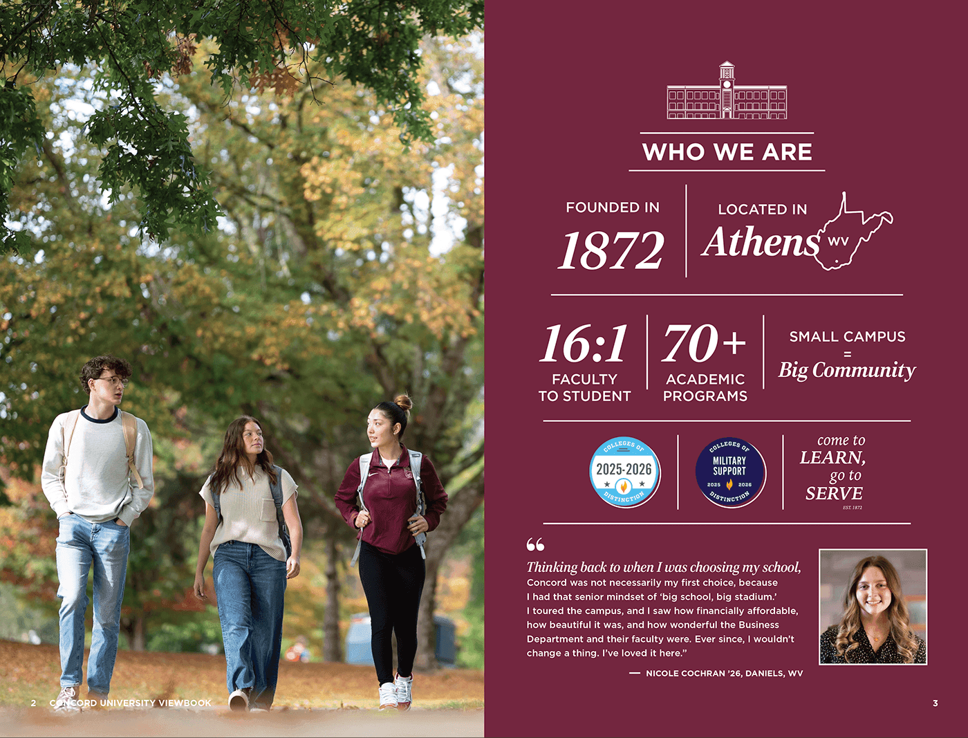
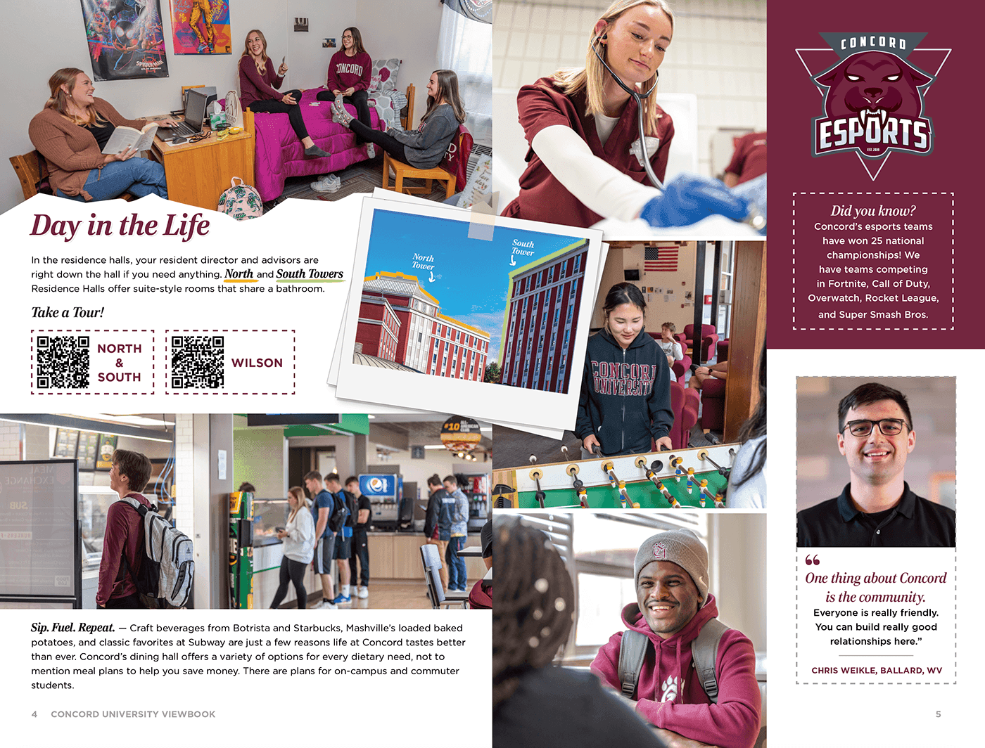
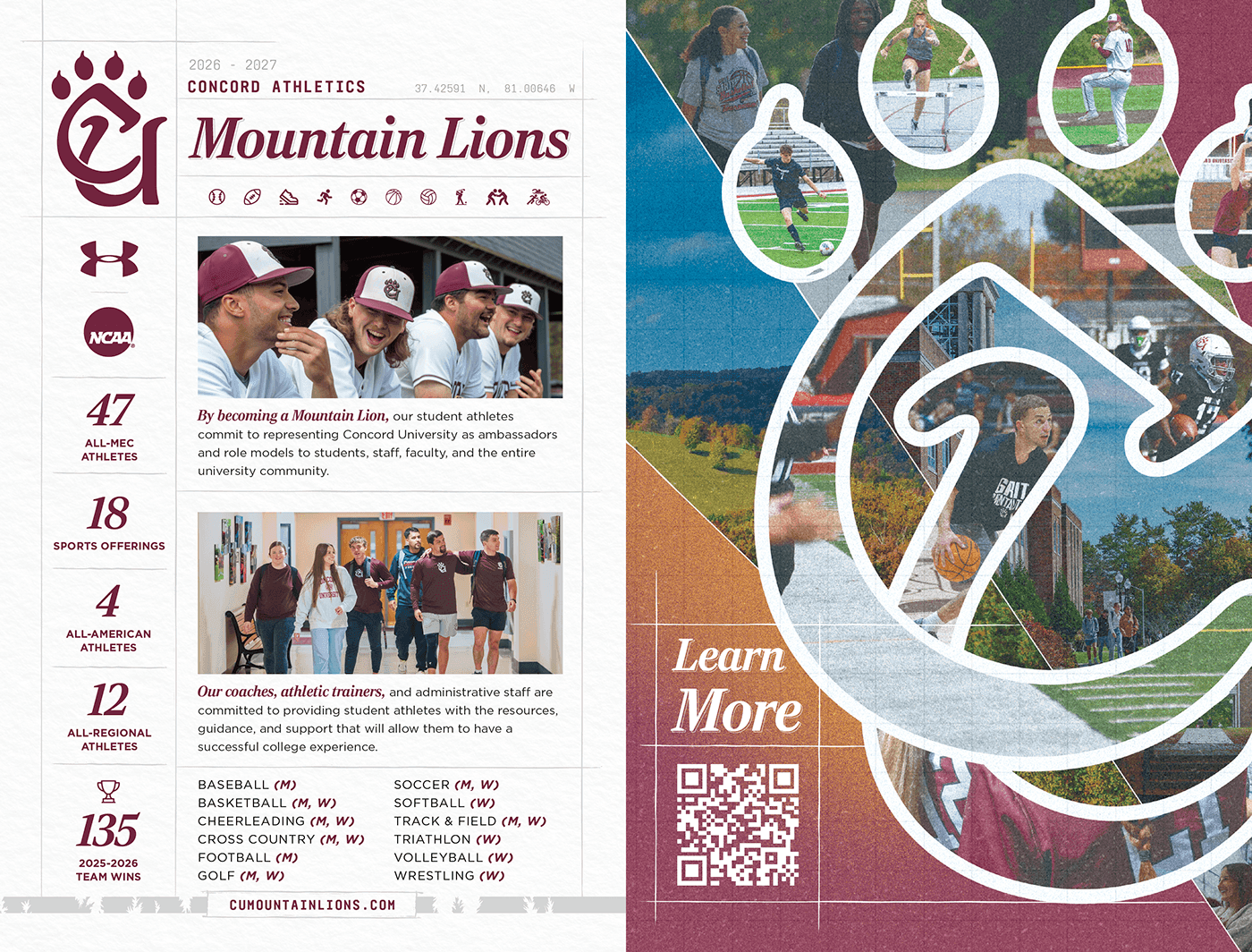
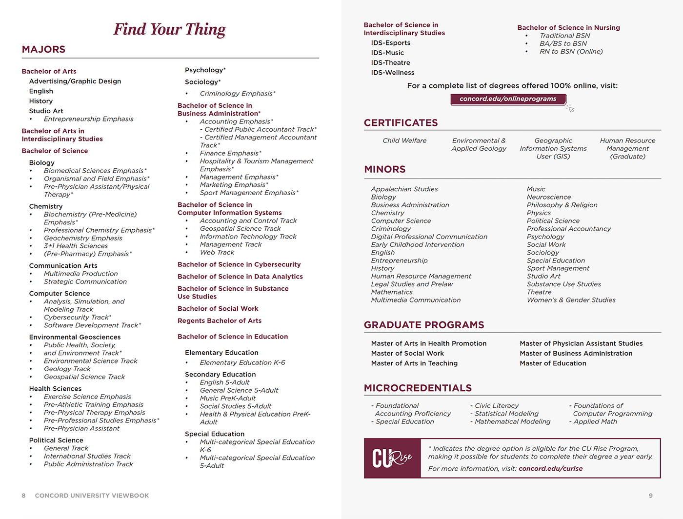
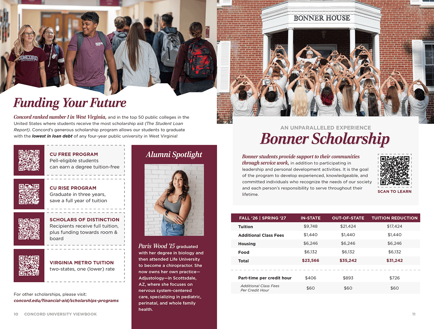
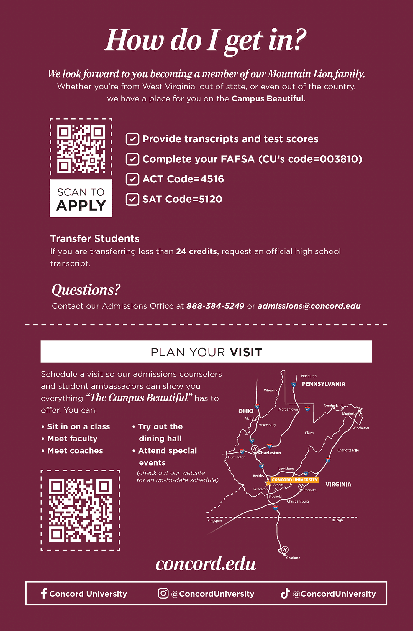
The Concord University Magazine is the institution’s voice in print — paced for long reading, not skim-and-scroll. Art direction, grids, and type choices carry photography from cover to colophon so features feel intentional rather than assembled.
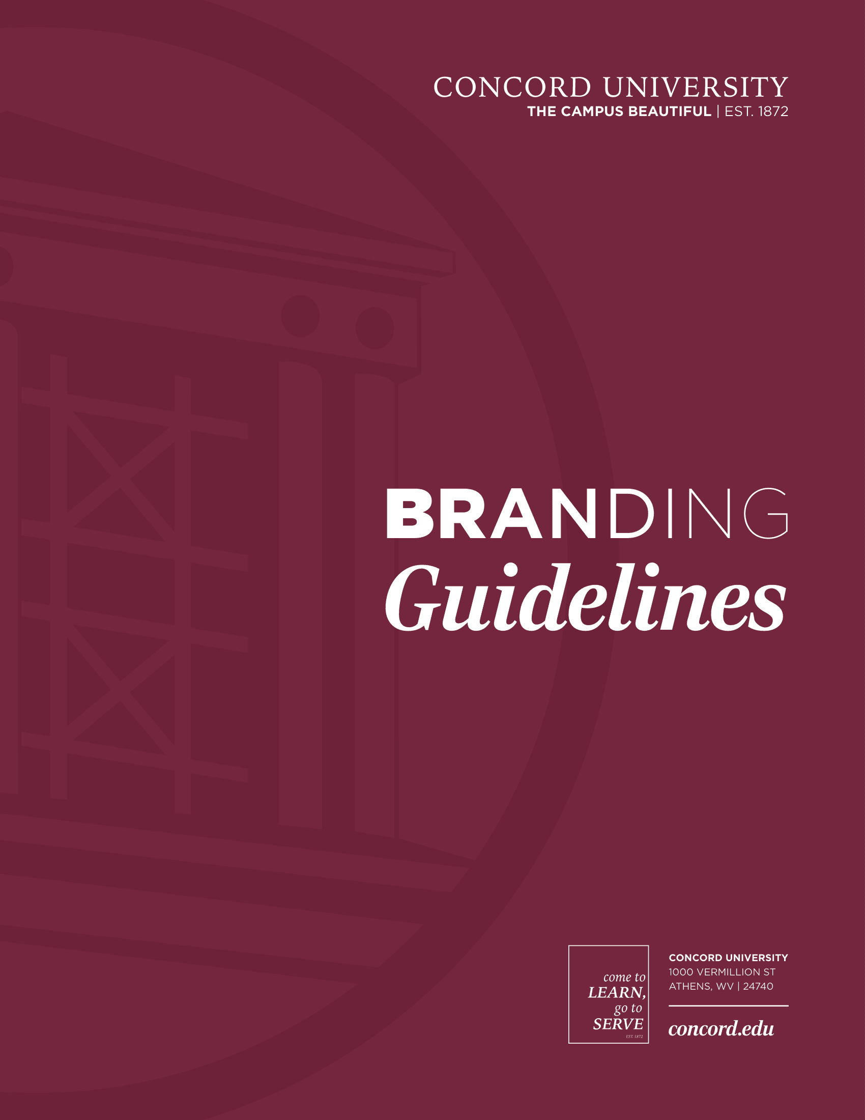
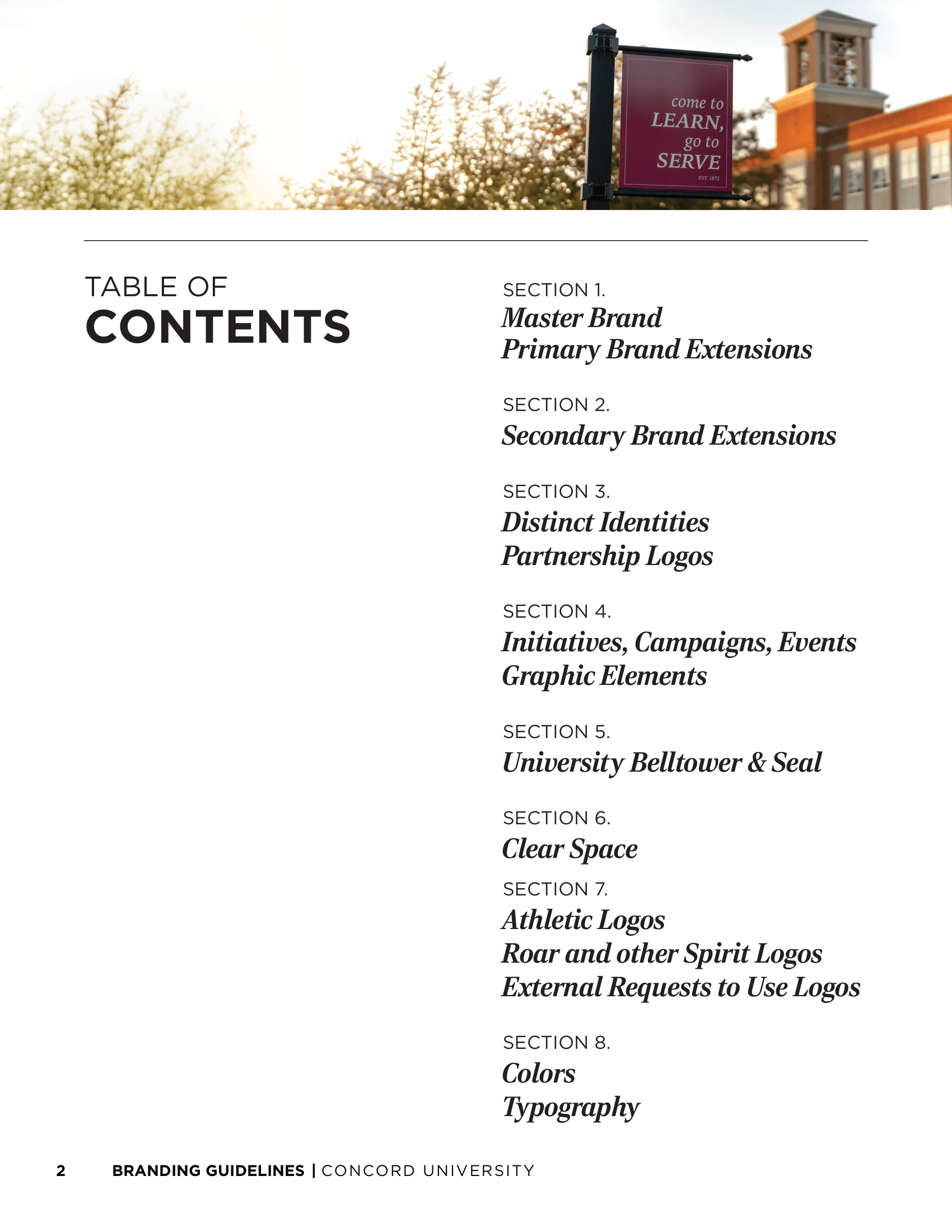
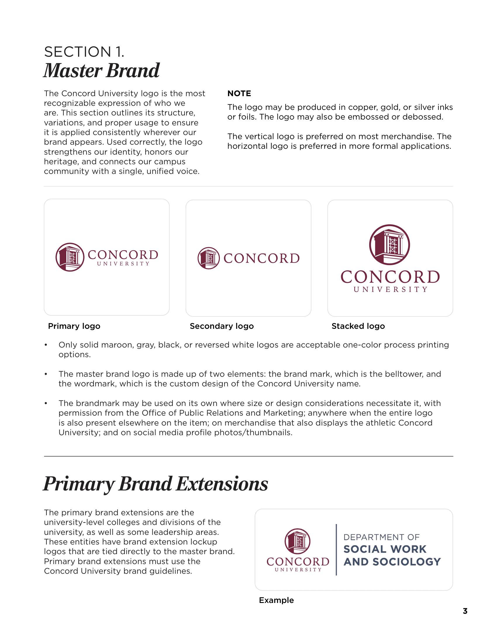
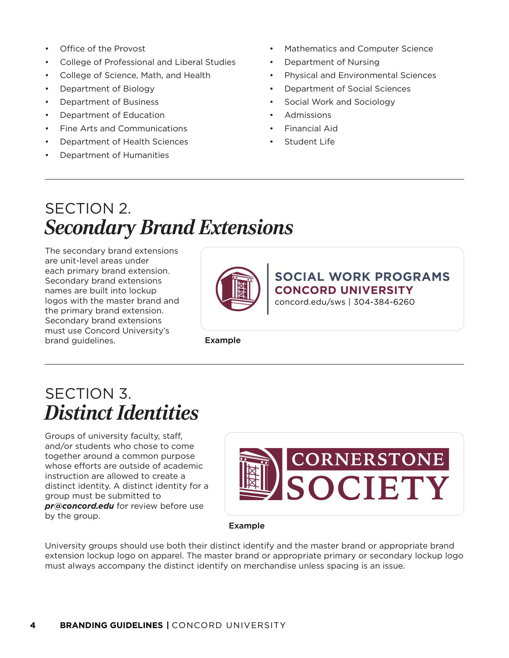
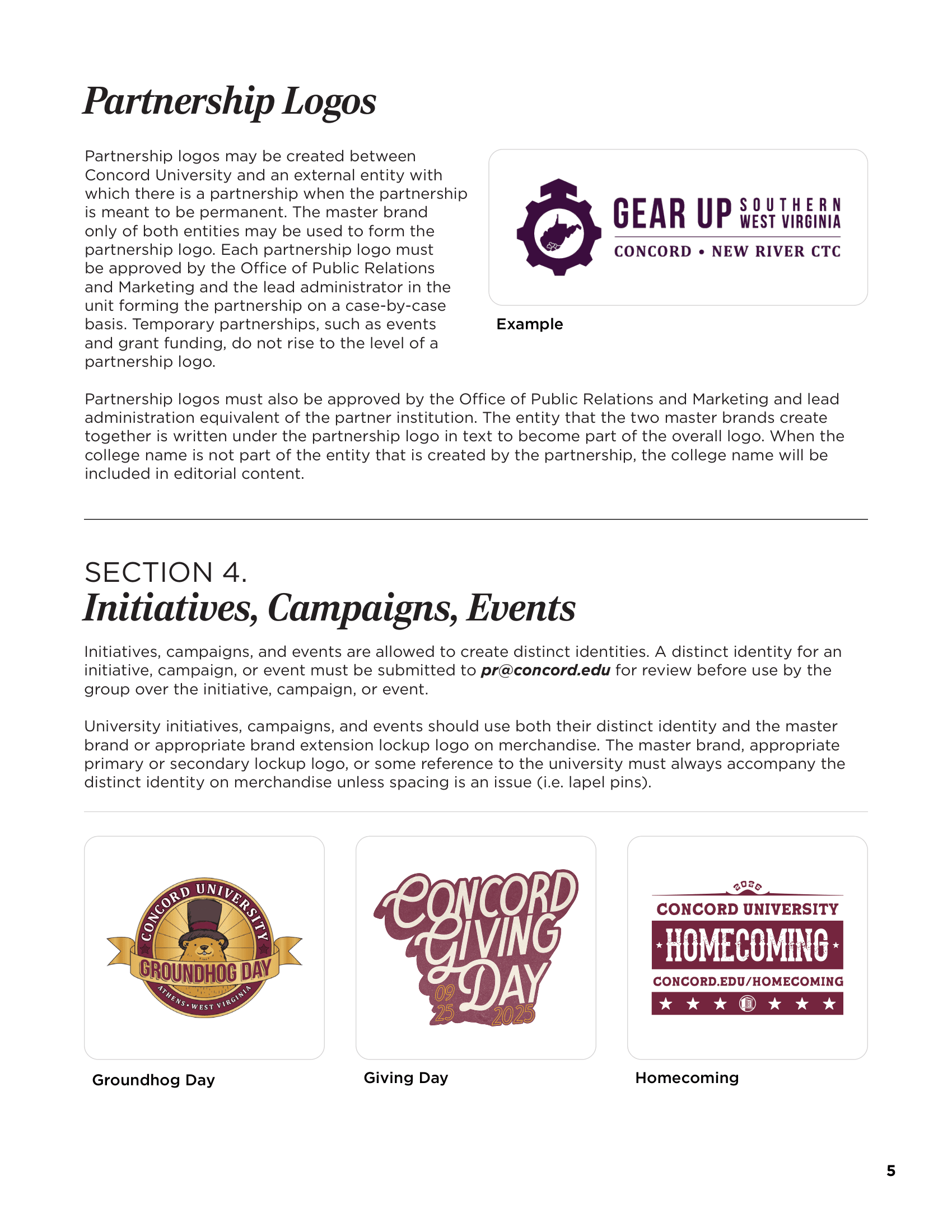
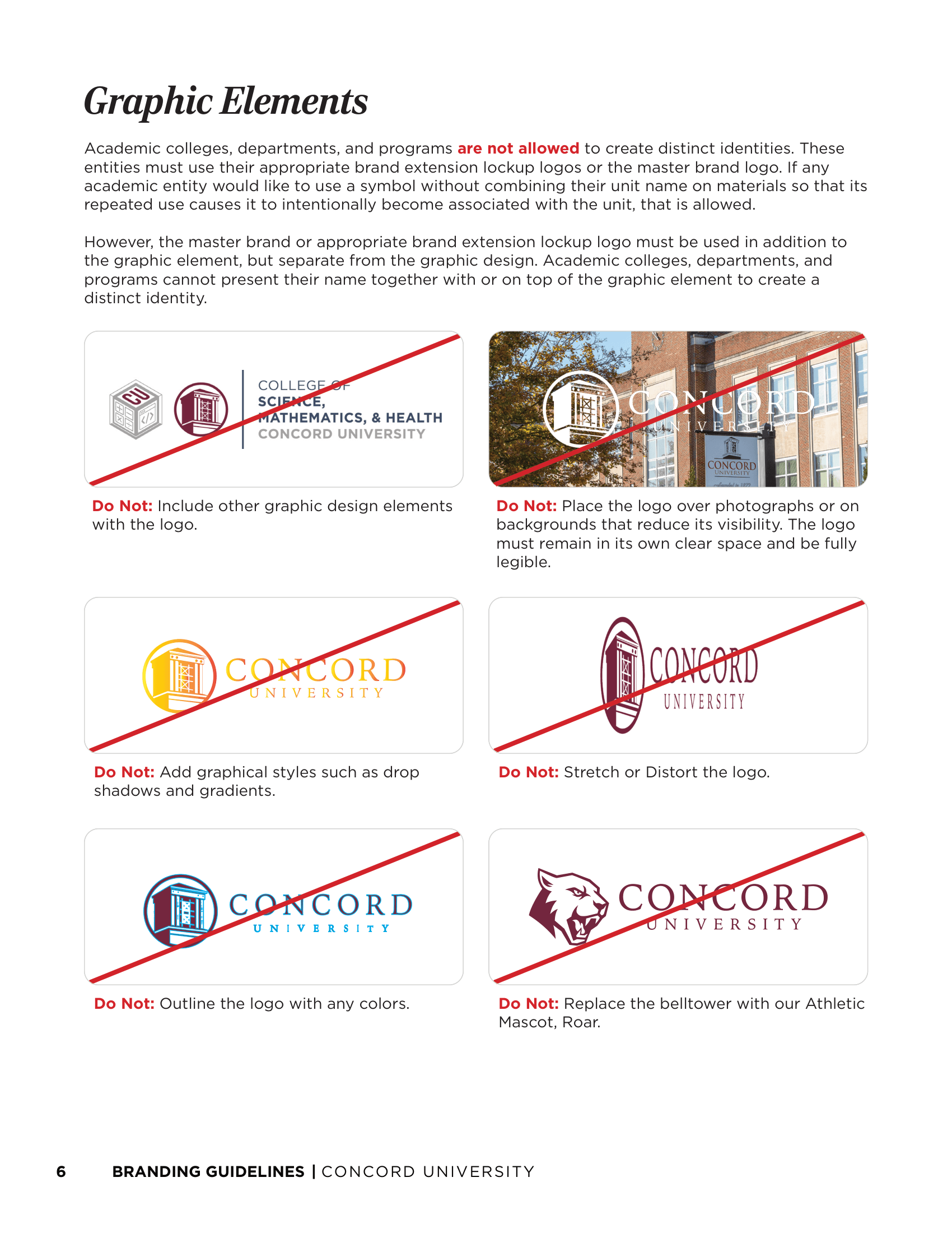
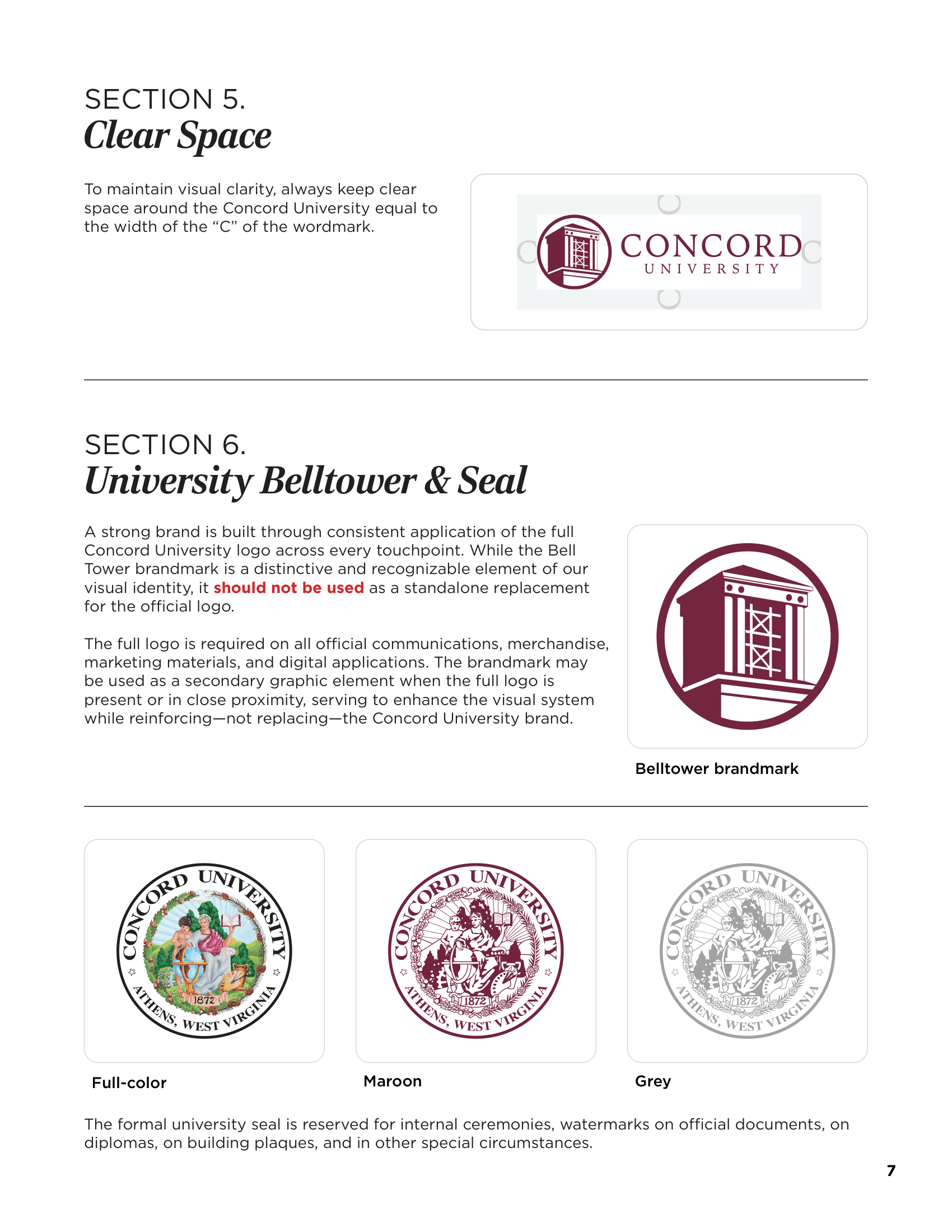
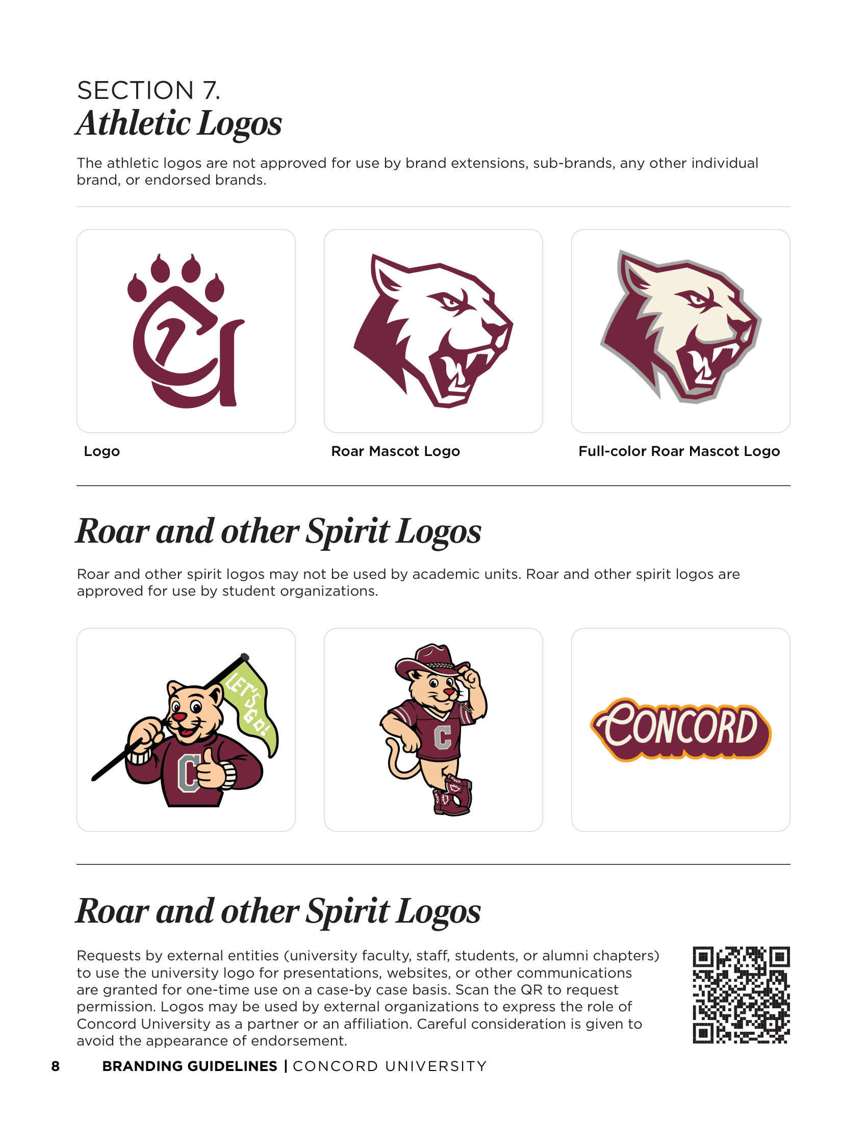
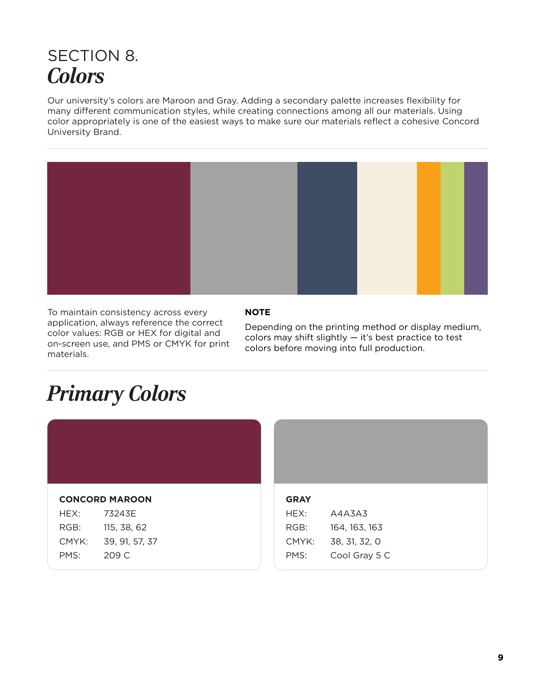
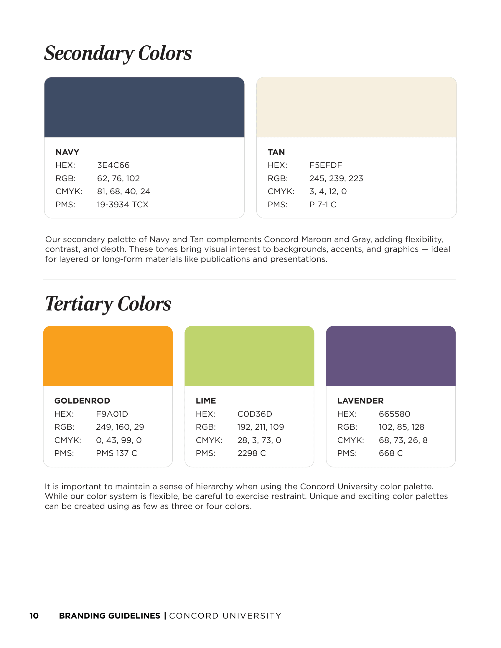
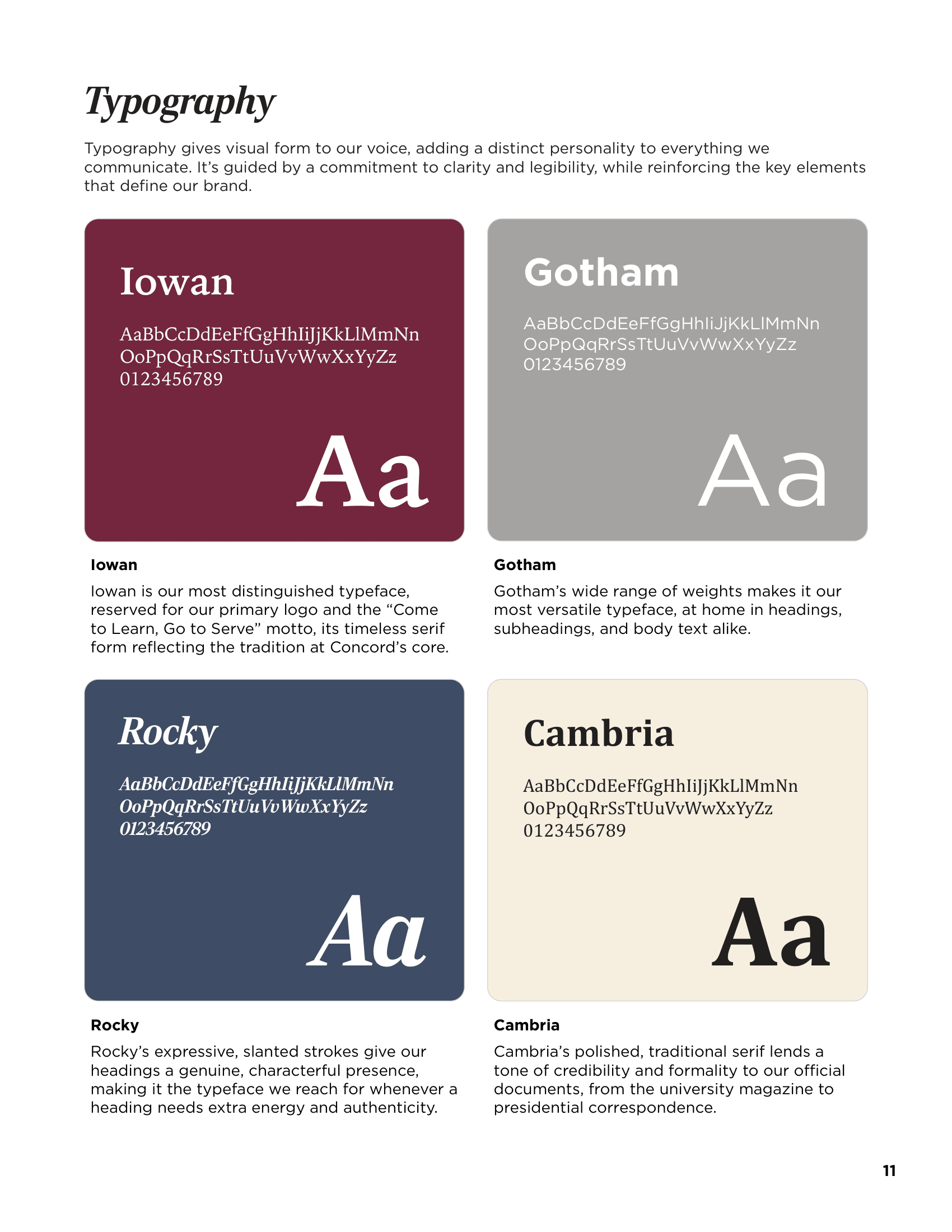
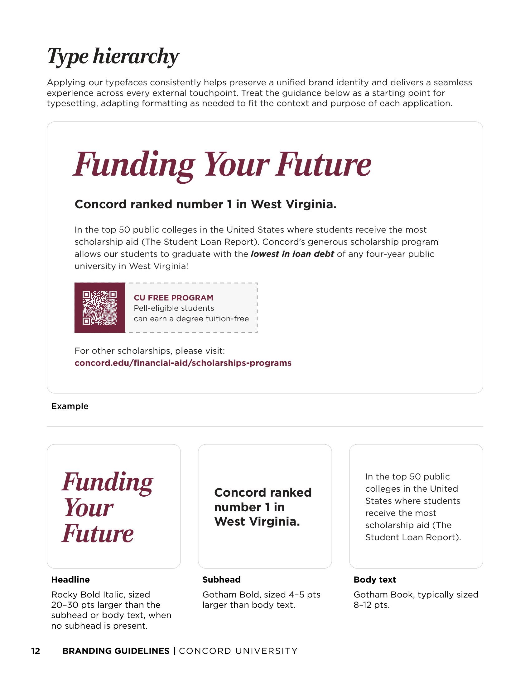
The official Concord University Branding Guidelines document defines the institution’s visual identity system — covering master brand lockups, primary and secondary brand extensions, athletic and spirit marks, official seal usage, brand colors (Concord Maroon & Gray), typography hierarchy (Iowan, Gotham, Rocky, Cambria), and clear space standards.
Identity system, promotional print mailers, digital assets, and merchandise created for Concord University’s Homecoming event — featuring custom postcard campaigns, social media suites, and t-shirt designs.